
Built for the fight. Trusted to win.
Victory starts with the right team.
Winning doesn't happen by accident.
Our battle-tested team has elected Governors, U.S. Senators, and Members of Congress nationwide by crafting advertising that changes minds, moves hearts, and wins races. We tell your story in a way that's bold, authentic, memorable, and anything but ordinary.
Winning isn't everything - it's the only thing.
And it's what we do best.
Ad Production
Political Strategy
Press and Communications
Media Buying
Design and Branding
Winners call POOLHOUSE.


"Brilliant creative. Strategic animals. Easy to work with and loyal. Winners hire POOLHOUSE."
Congressman Michael Rulli (OH-06)
"From start to finish, they crafted ads that told my story. As a first time candidate, they were a huge part of delivering the win."
Congresswoman Jen Kiggans (VA-02)
"Wow! Hiring POOLHOUSE was the best decision I ever made to take my campaign to the next level."
Congresswoman Monica De La Cruz (TX-15)
"I was glad to have them in the trenches with me; they were instrumental in helping flip a tough, democrat seat, and I'm proud they are on my team."
Congressman Nick Begich (AK-AL)
"Their strategy, messaging and creative helped me win a tough campaign. One of the best decisions I made was hiring POOLHOUSE."
Senator Glen Sturtevant (VA-12)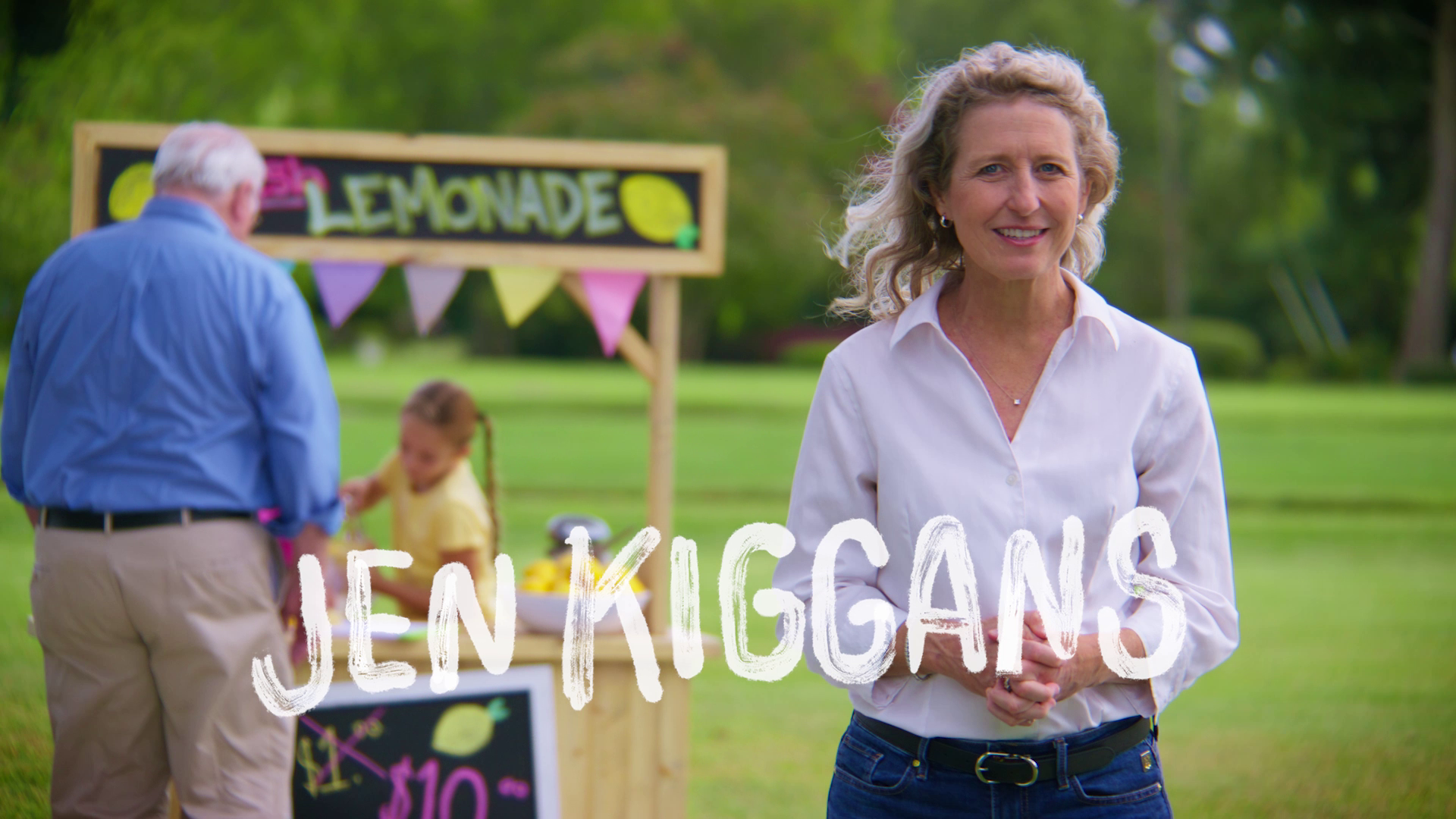
Kiggans For Congress
Lemonade
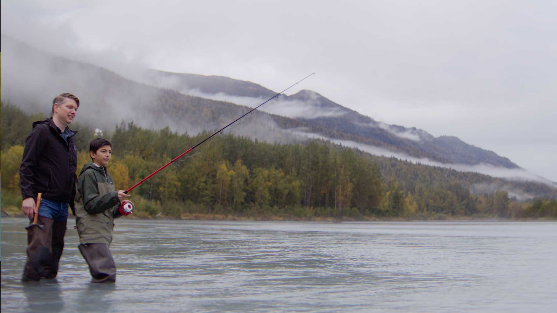
Begich For Congress
Alaska Way
Youngkin for Governor
New Day
McGuire for Congress
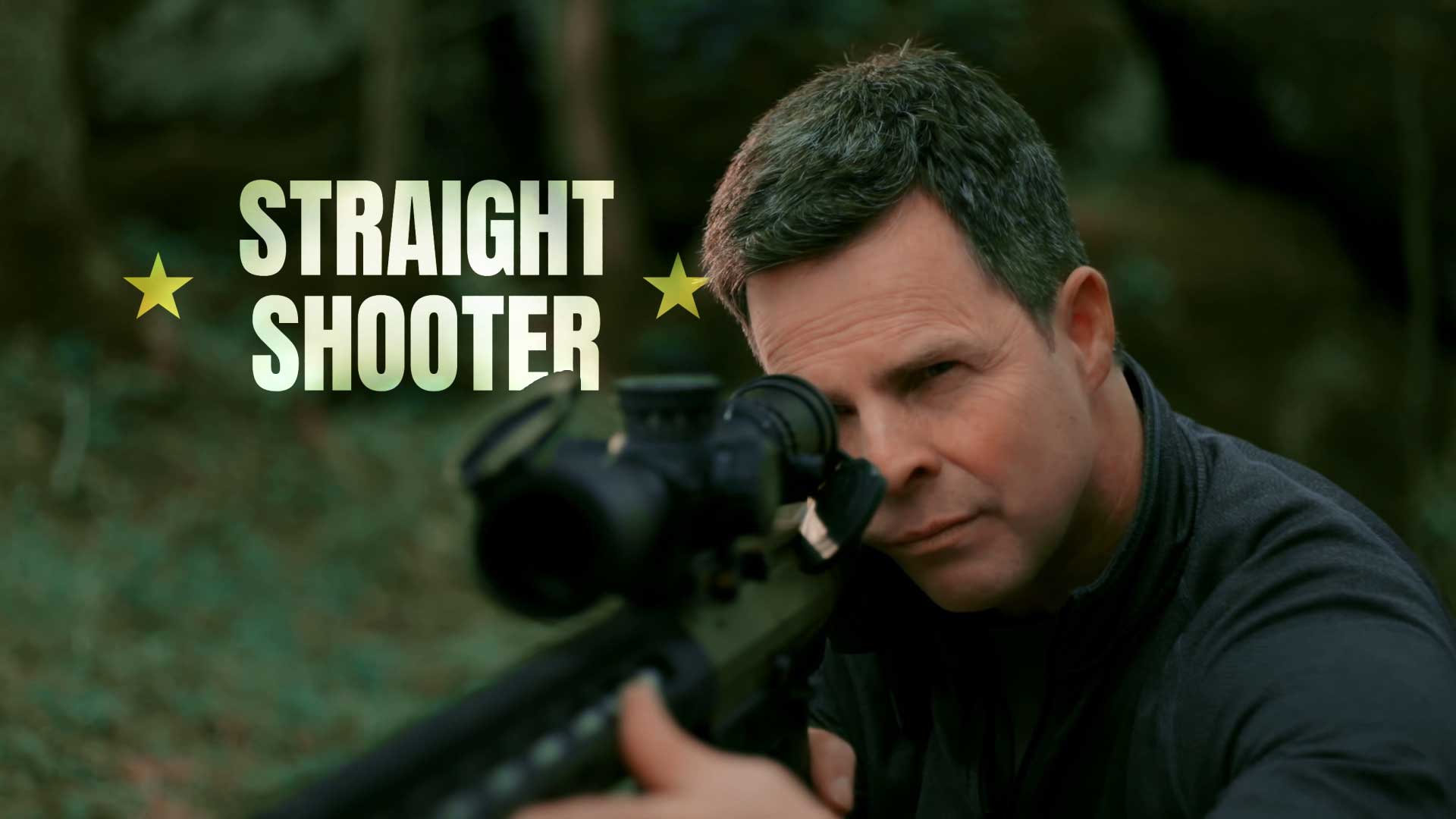
Sniper
Schmidt for Congress
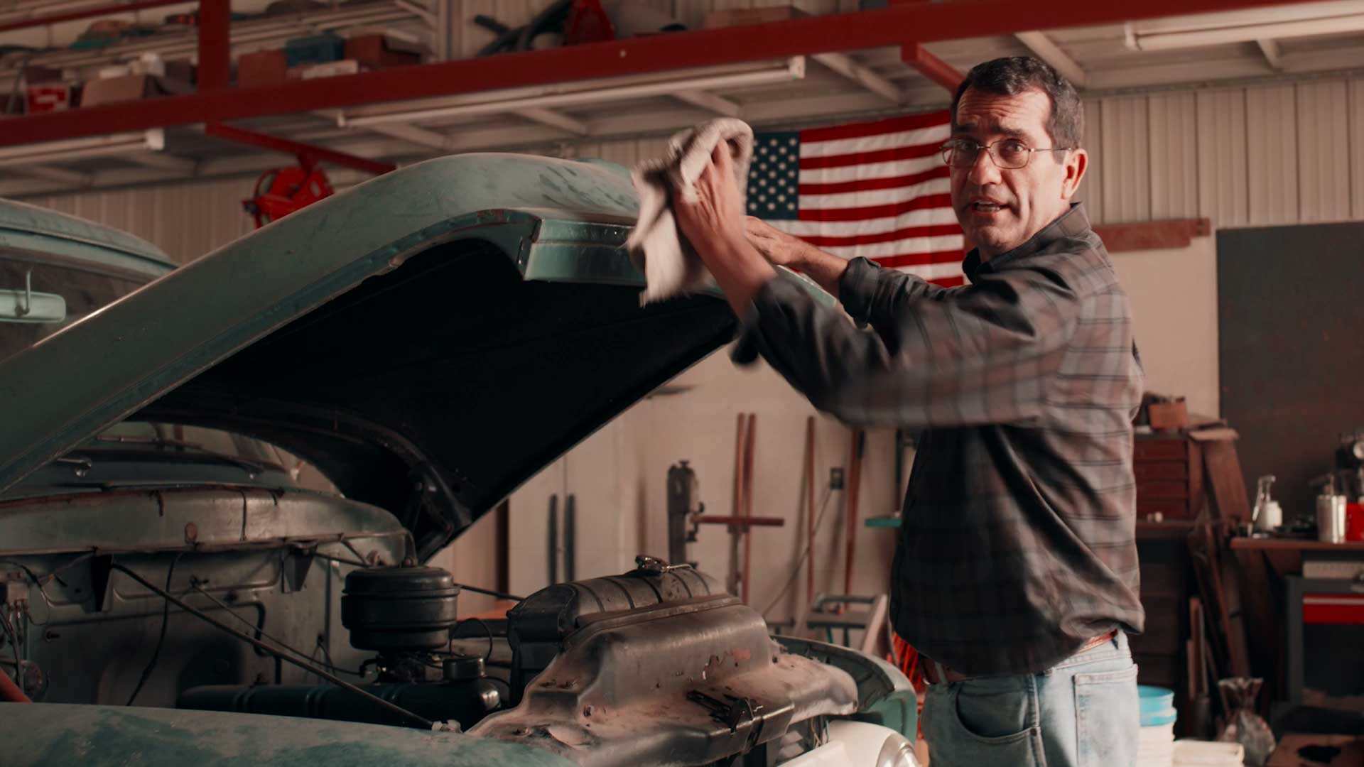
Truck
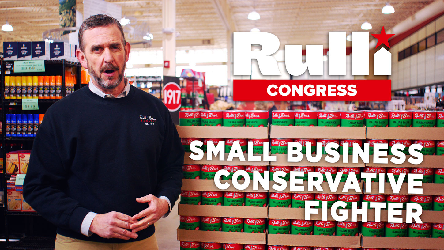
Rulli for Congress
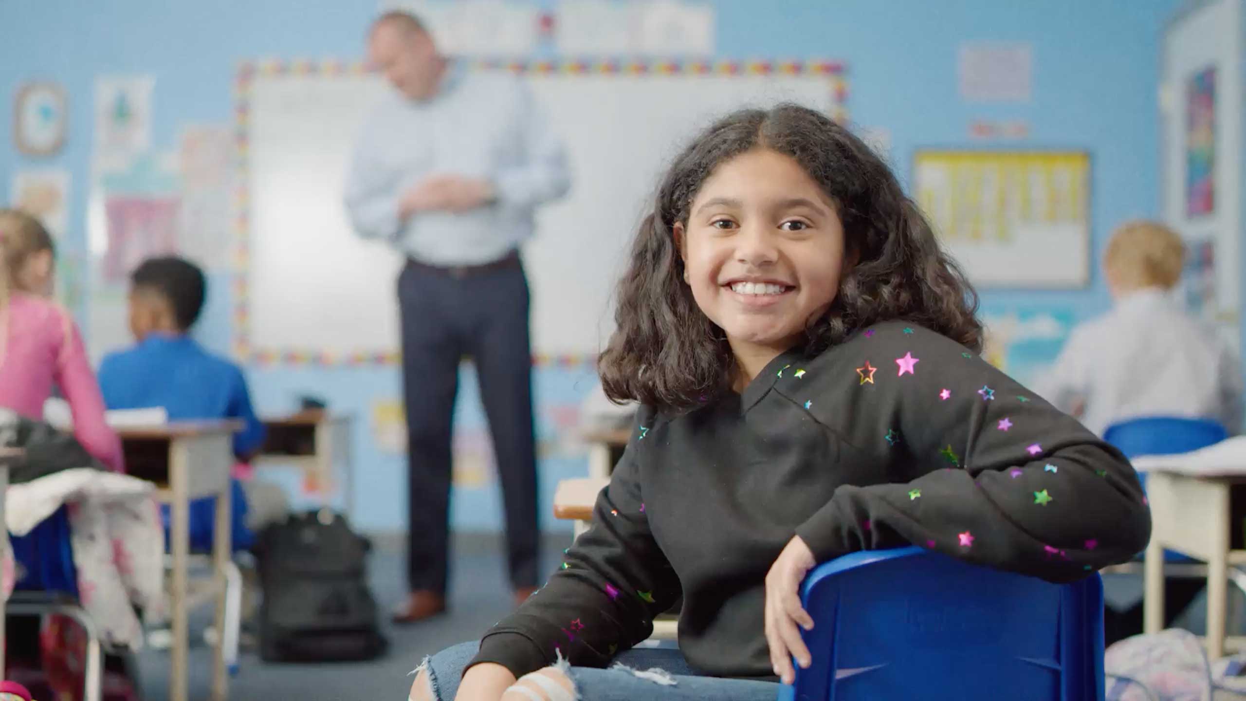
Grocery
De La Cruz For Congress
Clear
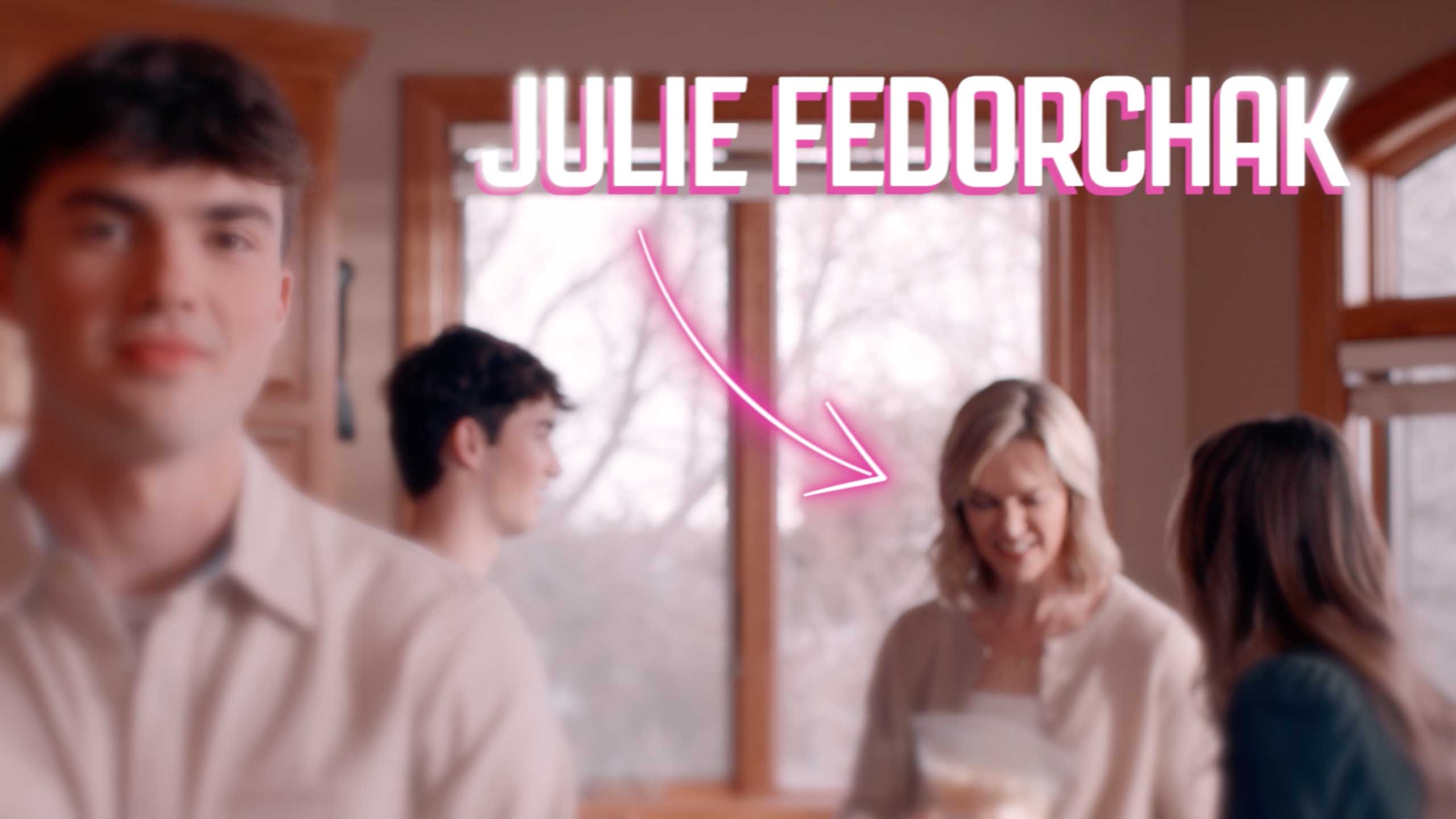
Fedorchak for Congress
Fresh
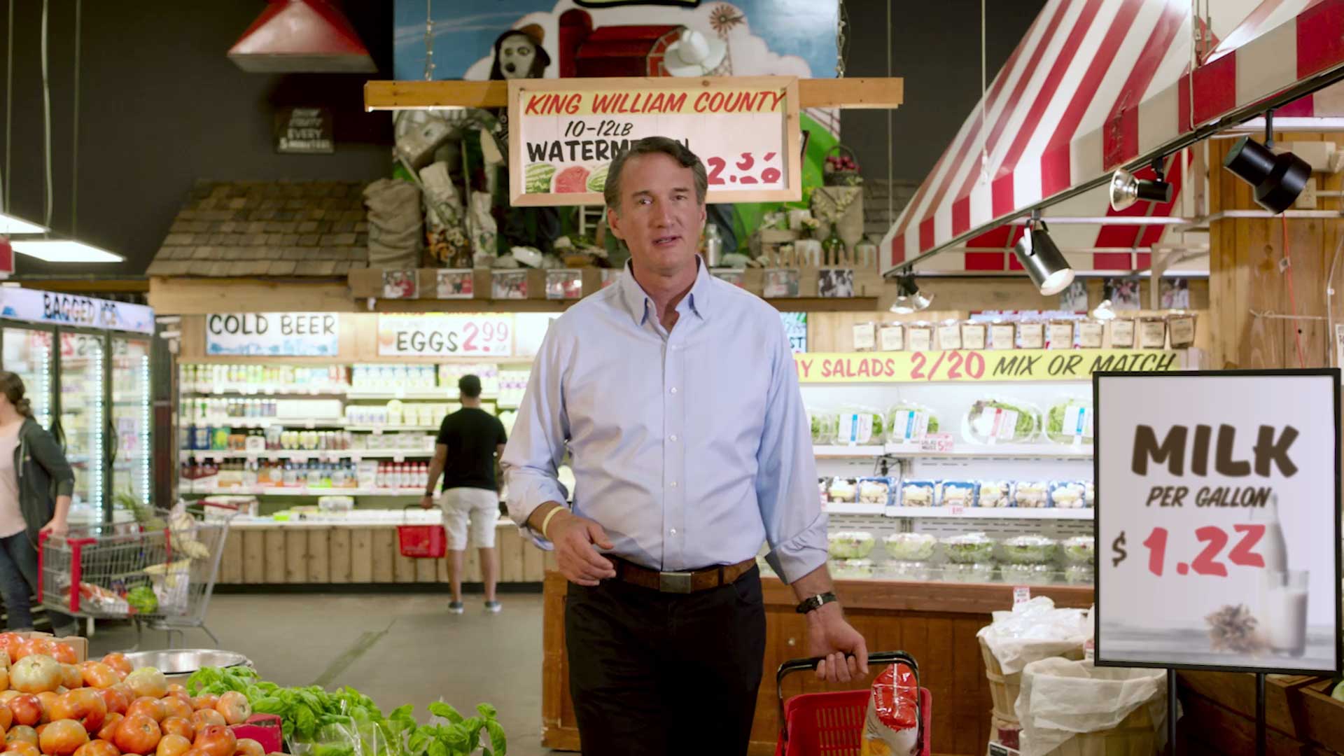
Youngkin for Governor
Common Cents
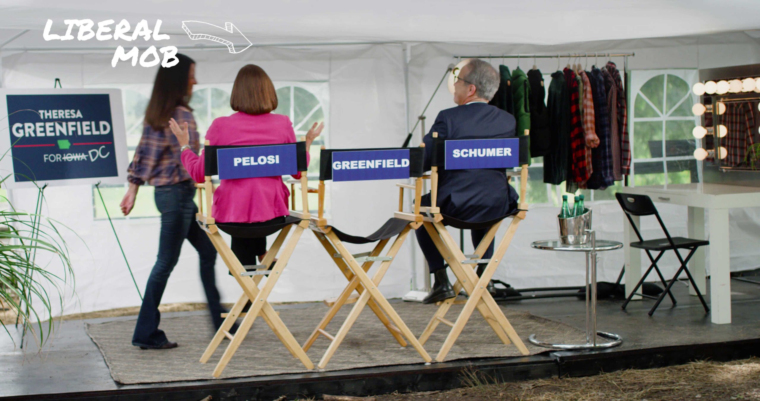
Priorities for Iowa
As Seen on TV
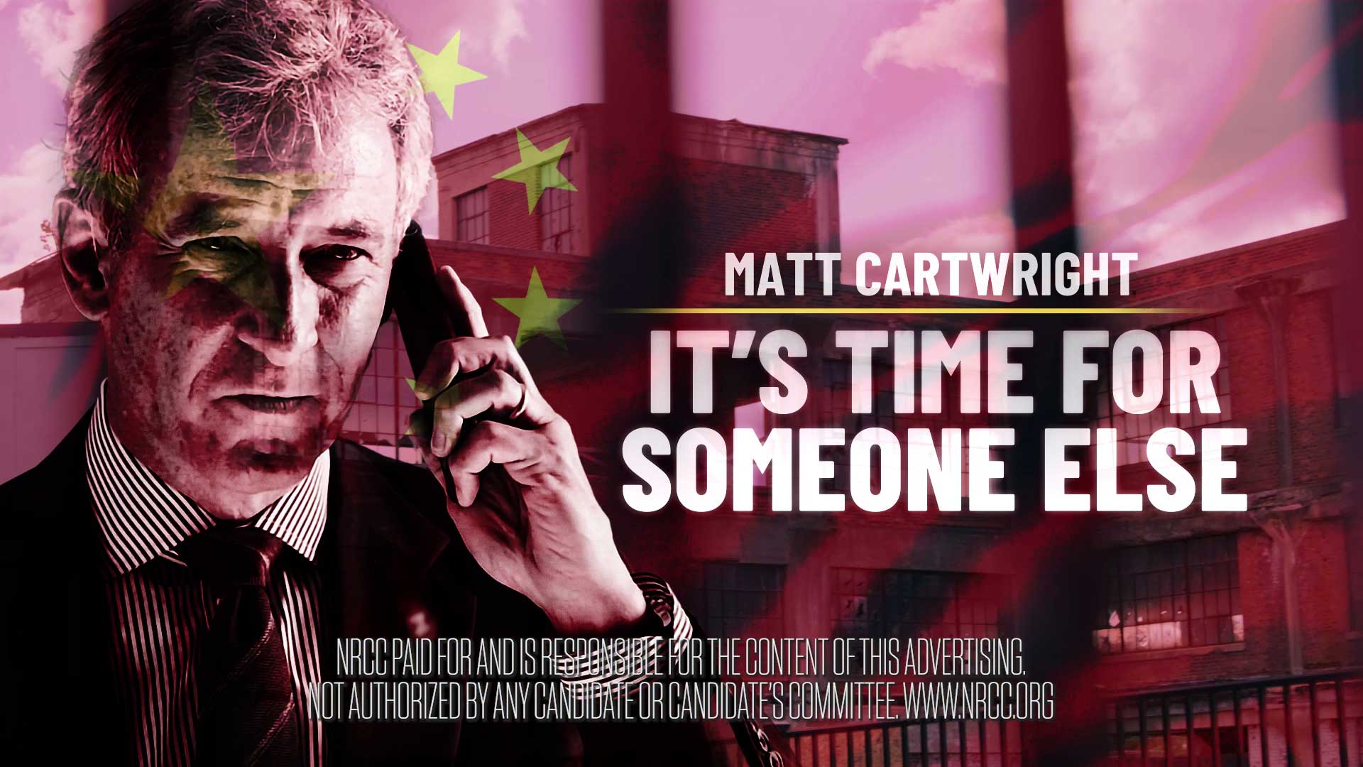
National Republican Congressional Committee
Not Again
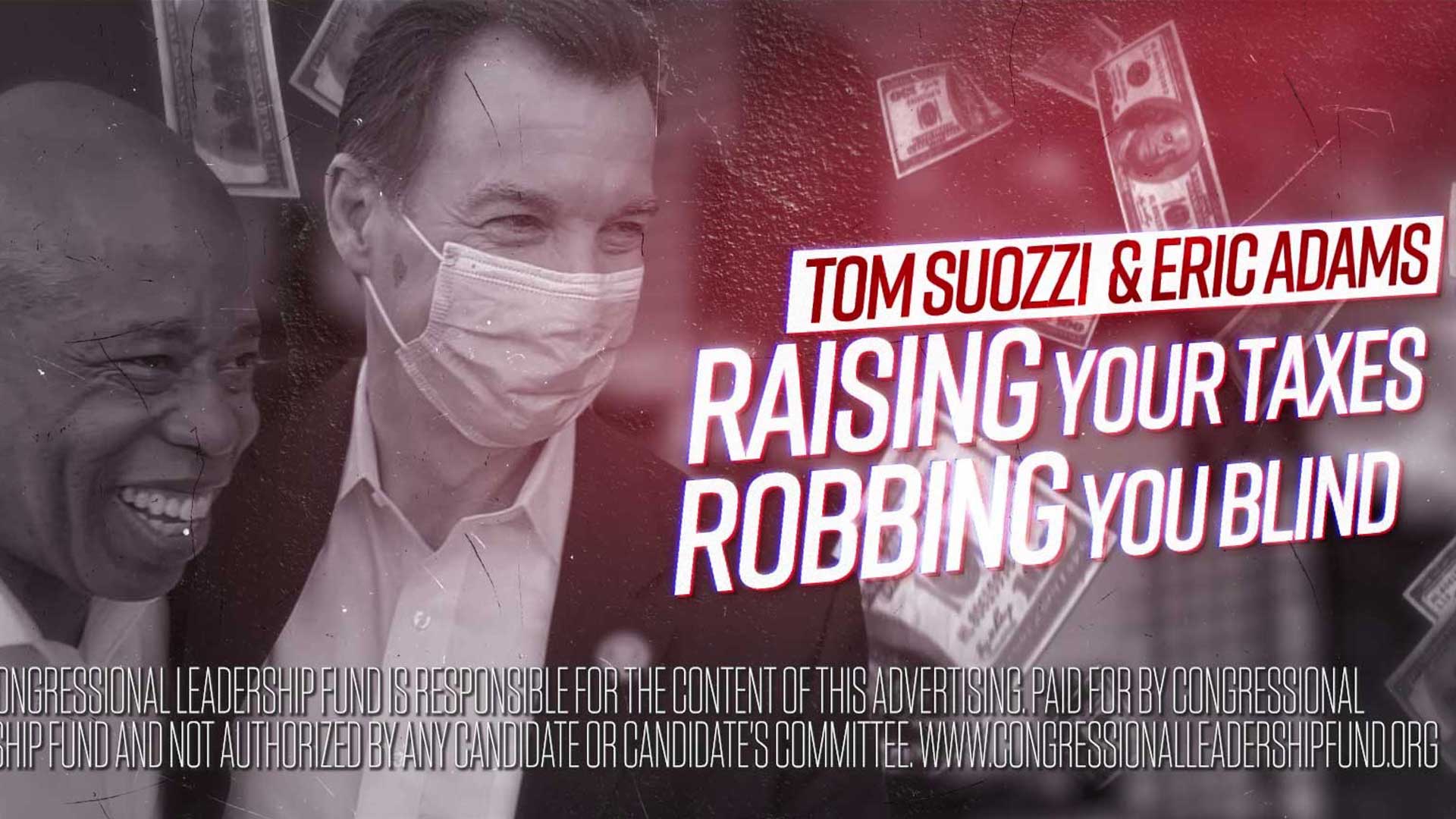
Congressional Leadership Fund
Steal
Mike Cherry for Delegate
I Should Know
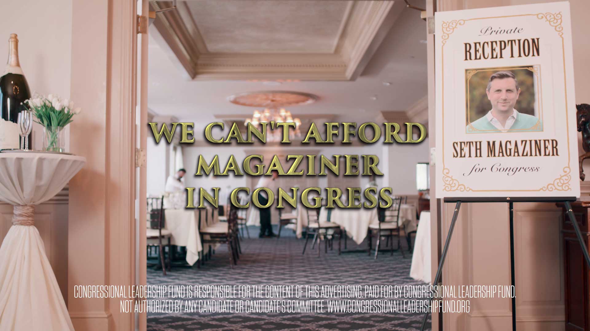
Congressional Leadership Fund
Privilege
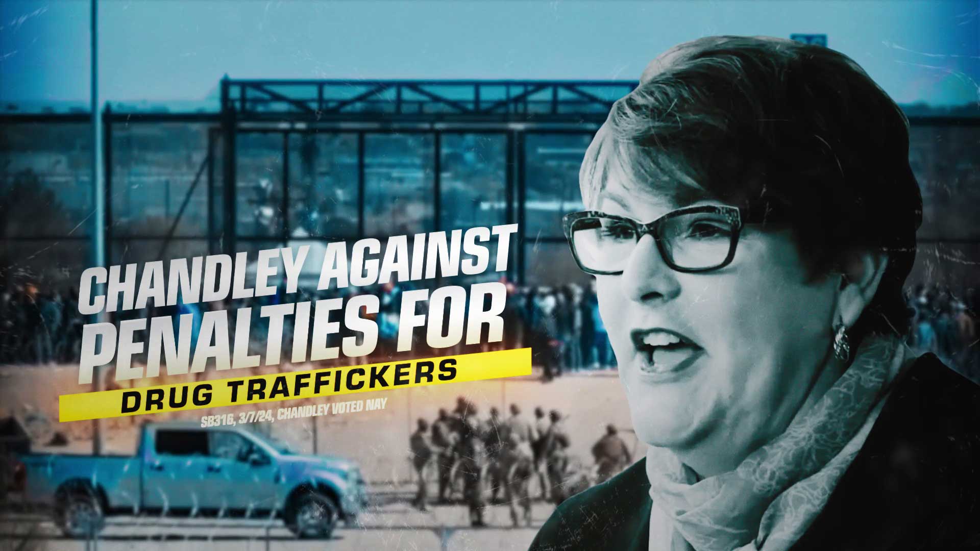
Republican State Leadership Committee
Dangerous
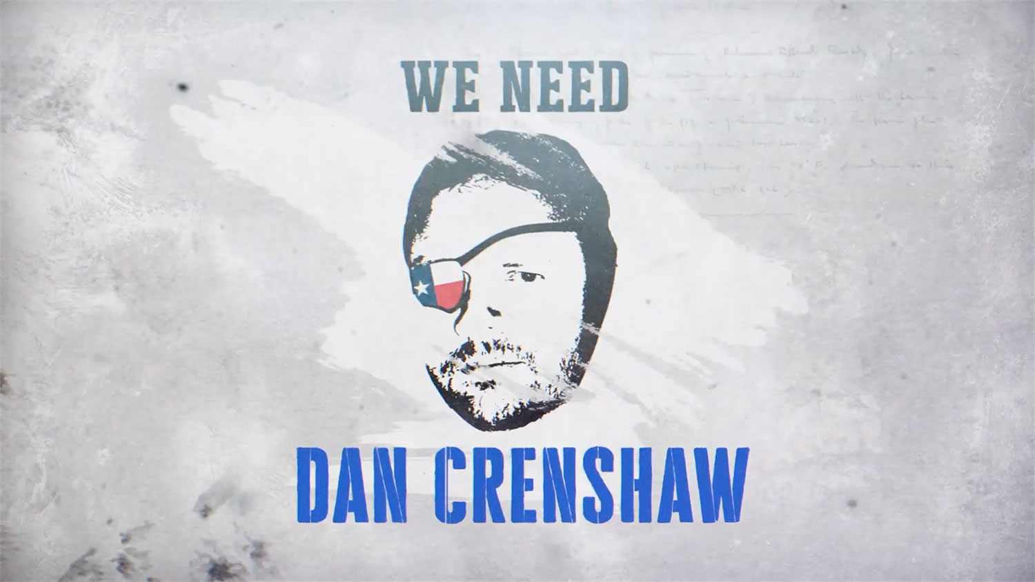
With Honor Fund Inc.
We Need Crenshaw
Together for Nevada's Future
Scars
American Patriots PAC
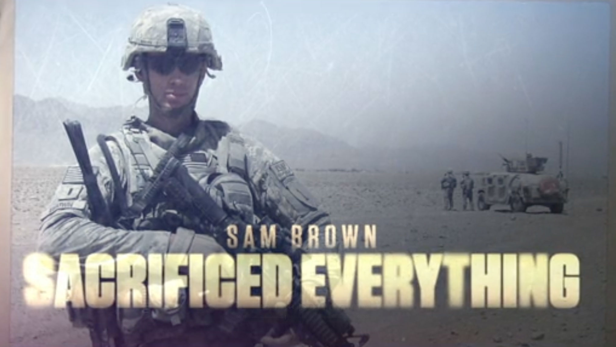
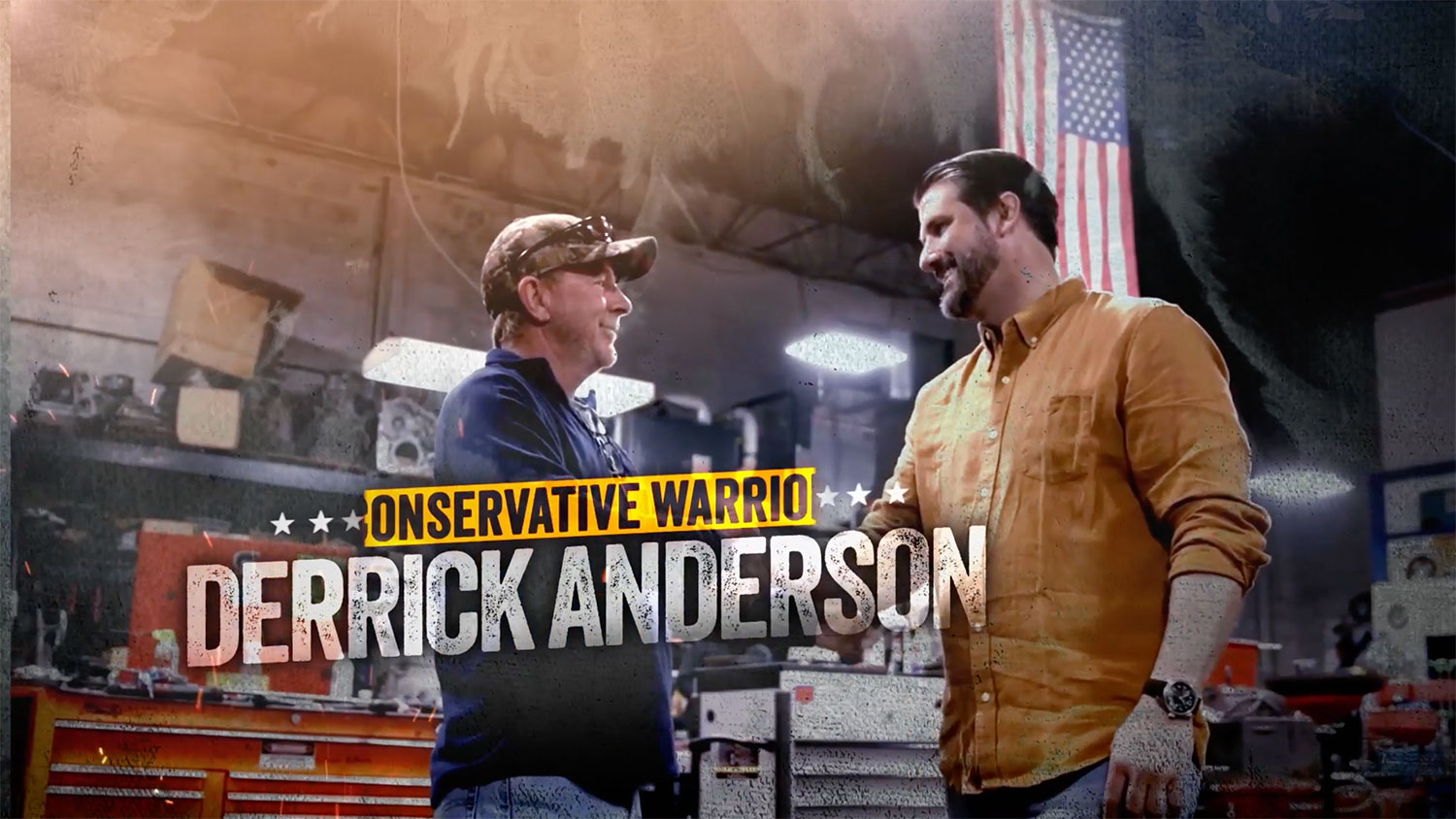
Warrior