
When the Stakes Are High, We Deliver

Advocacy that Commands Attention
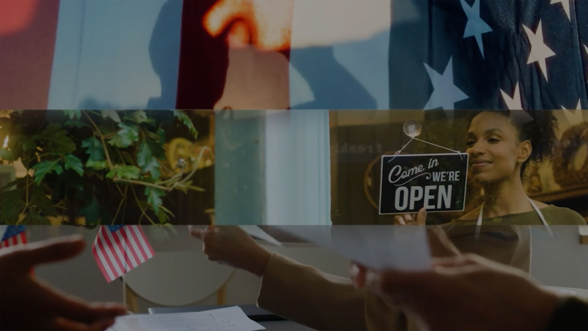
Winning starts with creative that cuts through. We helped reframe private equity by focusing on how it fuels small businesses across the country.
Lorem ipsum dolor sit amet consectetur. Bibendum at neque mauris consequat. Quis morbi sit lectus dictum ante varius morbi laoreet vitae. Vulputate elementum quis tristique purus. Lorem ipsum dolor sit amet consectetur. Bibendum at neque mauris consequat. Quis morbi sit lectus dictum ante varius morbi laoreet vitae.
Humanizing Industries & Issues
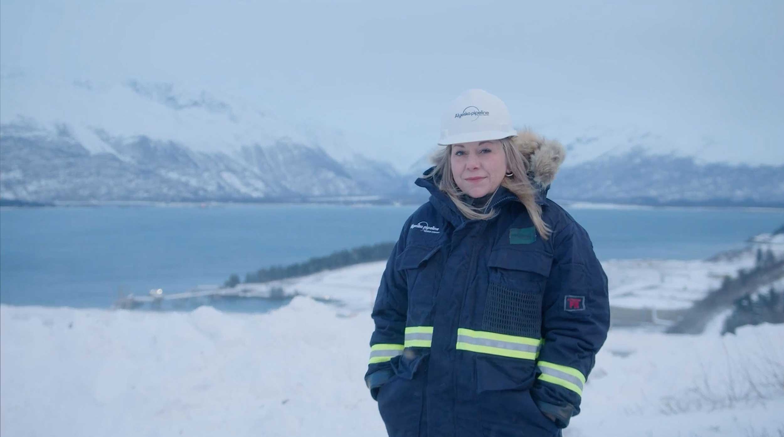
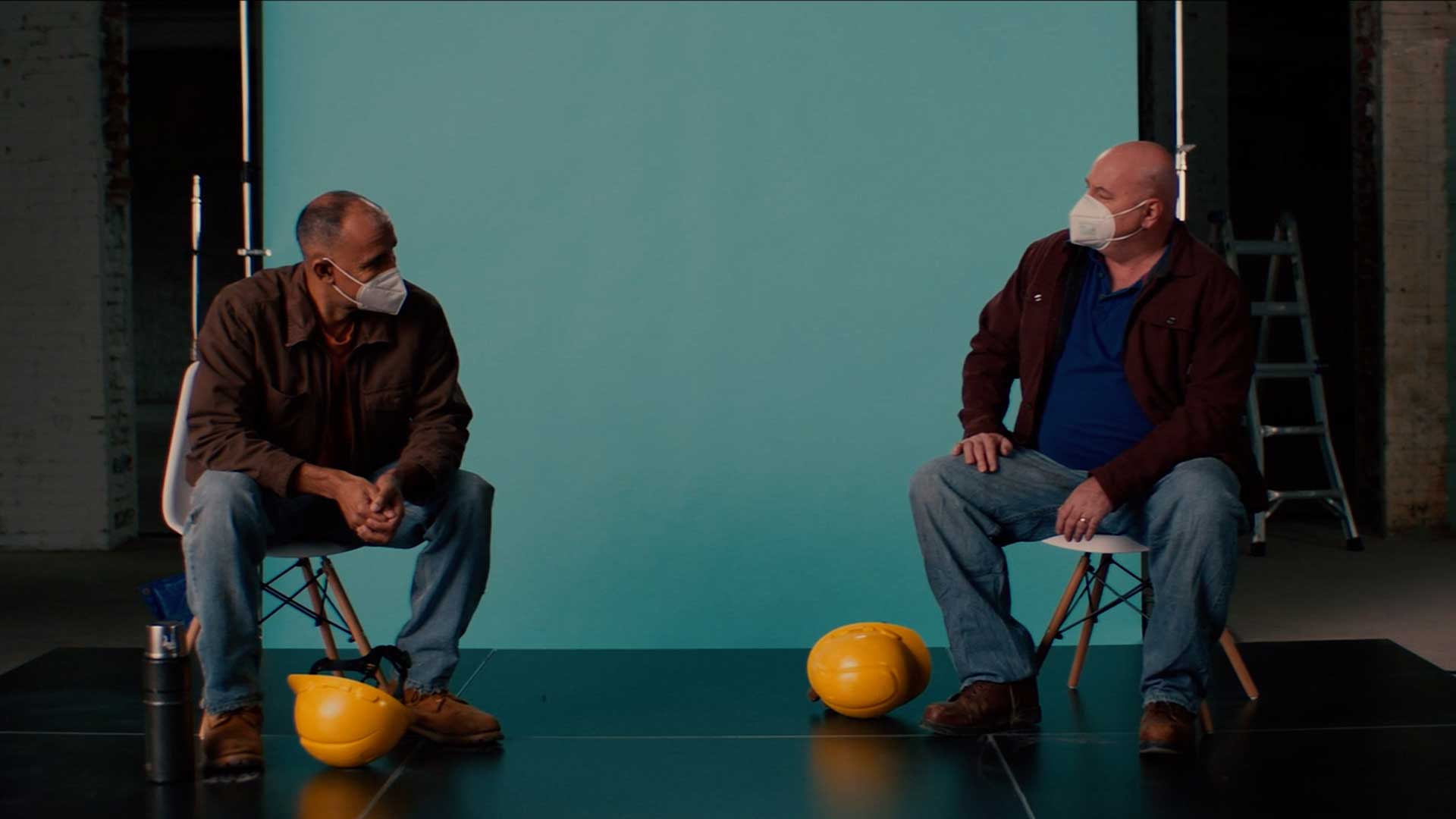
When policy gets personal, it becomes powerful. With API, we traveled the country to capture the human story of American energy and deliver it to Washington.

Moving fast. Winning faster.
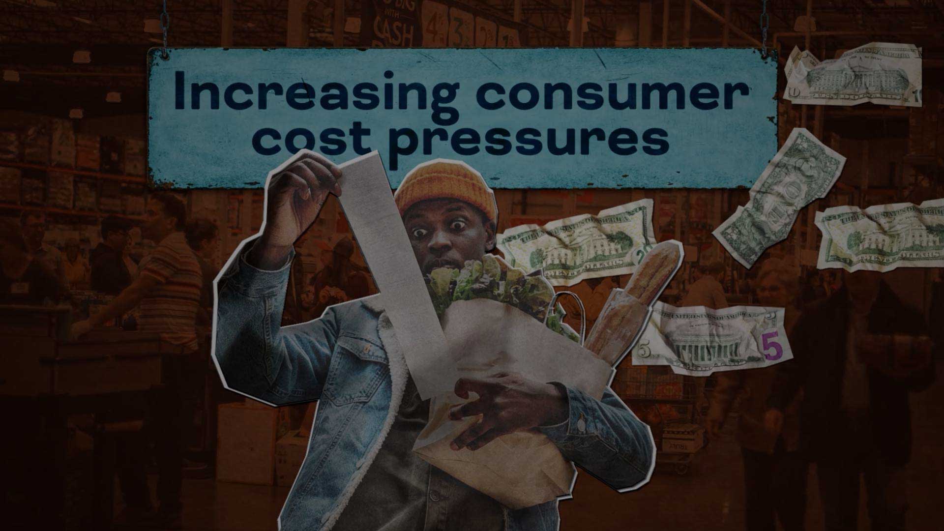
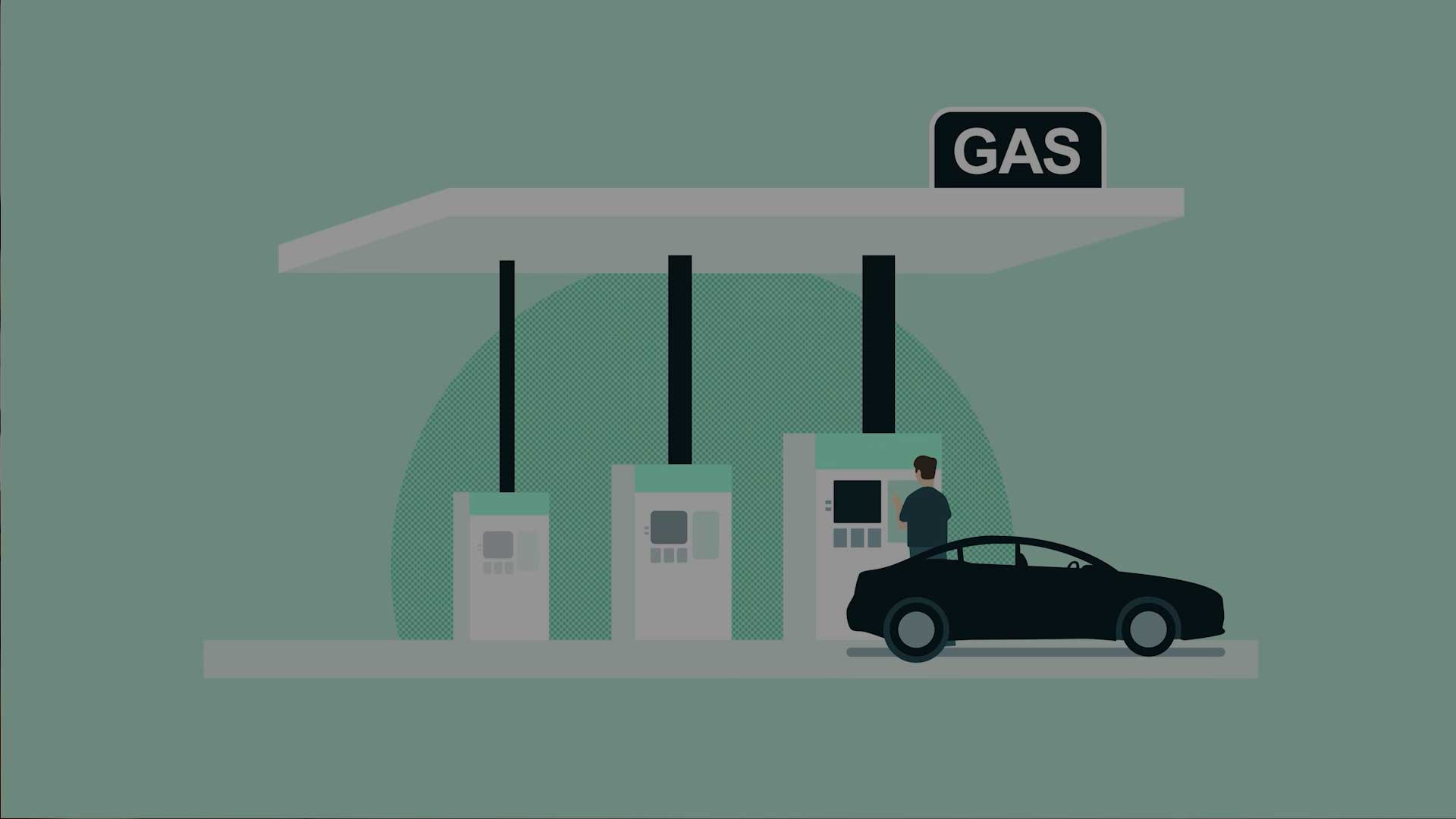
A lot can change in 24 hours. Your creative strategy can be as nimble as you are. When a hidden tax threatened consumers, we spun up a campaign in days and moved voters before the bill gained steam.
Lorem ipsum dolor sit amet consectetur. Bibendum at neque mauris consequat. Quis morbi sit lectus dictum ante varius morbi laoreet vitae. Vulputate elementum quis tristique purus. Lorem ipsum dolor sit amet consectetur. Bibendum at neque mauris consequat. Quis morbi sit lectus dictum ante varius morbi laoreet vitae.

A Deeper Understanding
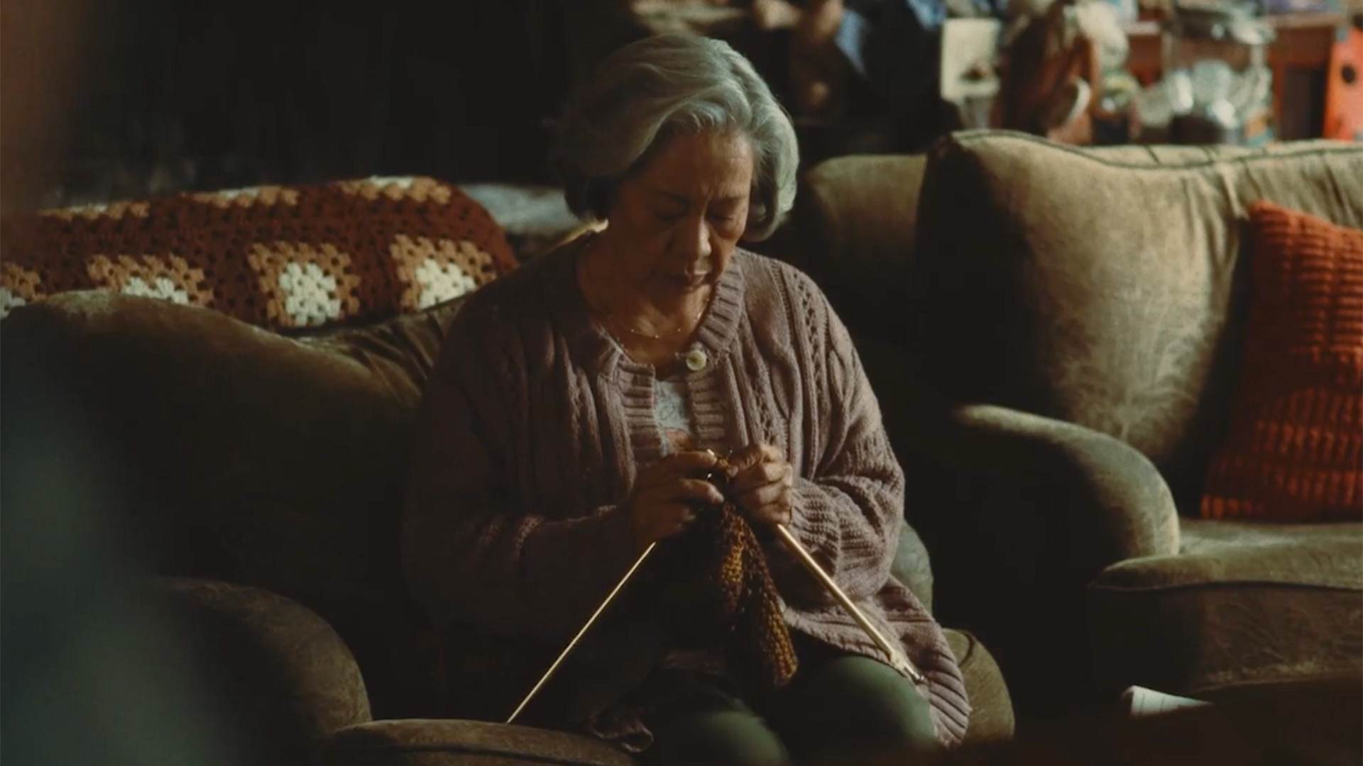
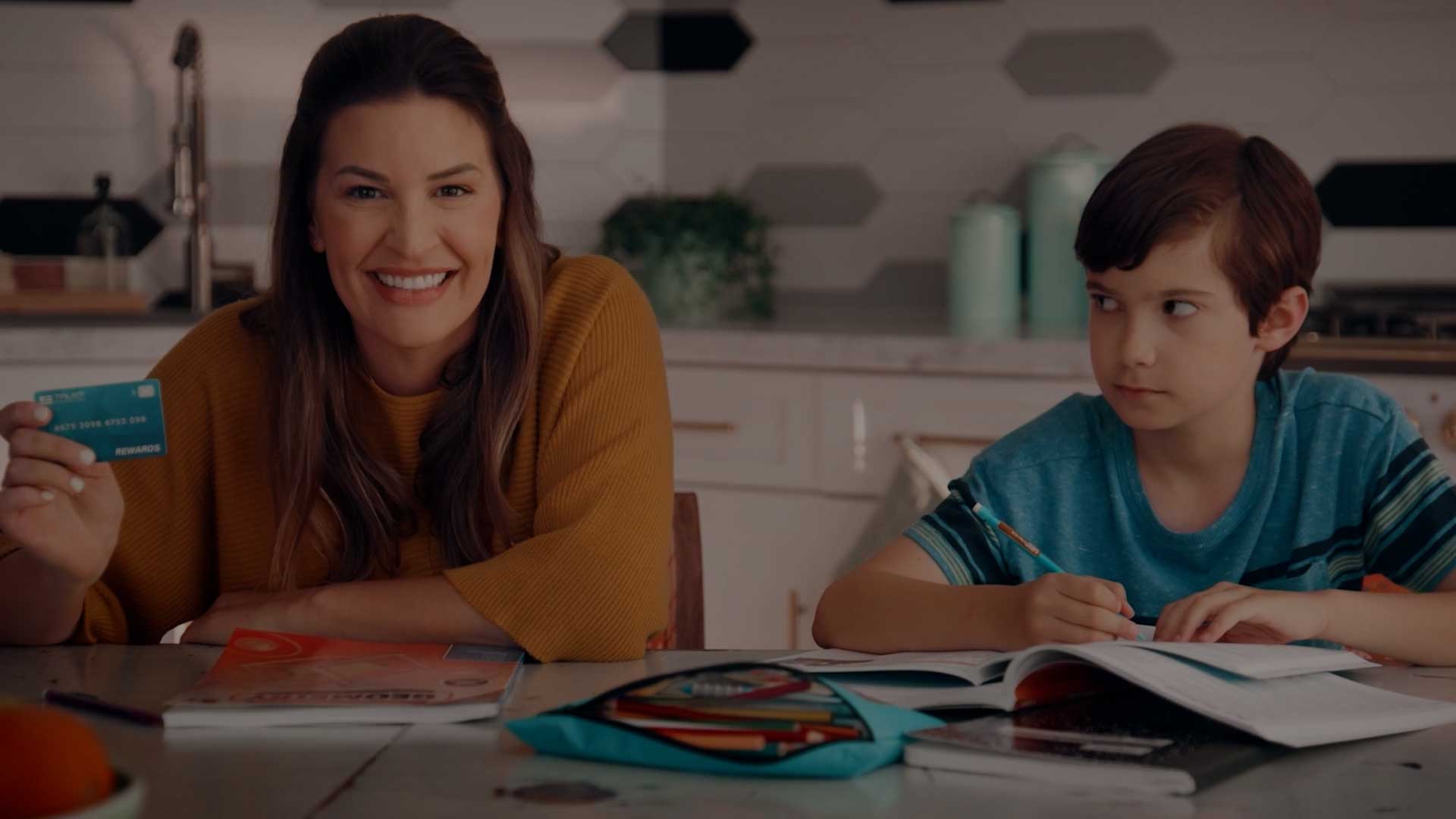
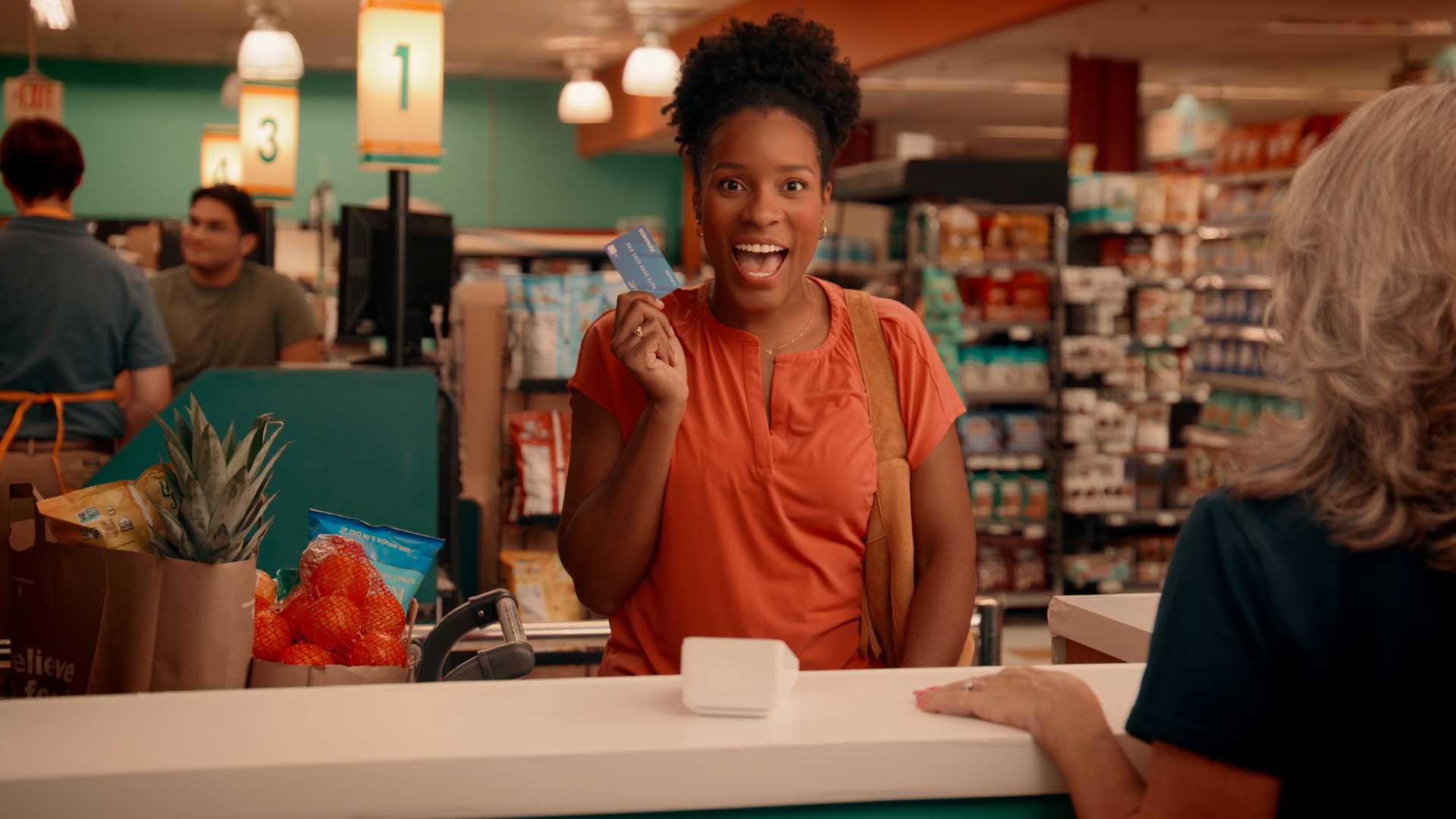
Whether it's breaking down a complex issue or showing real-world impact, we craft creative that helps policymakers get it. We made credit card reform real, showing how rewards were at risk and why that mattered.
One team that does it all.
Our public affairs experts understand the intersection of politics and policy.
We help you communicate meaningfully to motivate your audiences.
Strategic Partnerships
Strategy and creative must go hand-in-hand: a brainstorm and a battle plan, an artist and an analyst, a dreamer and a doer. Our team is structured to deliver you both, expanding your own in-house capabilities and making even the loftiest of objectives feel conquerable.
Ad Creation
You don't want an ad that's just good. You want an ad that wins. We build creative that can stand up to the toughest competitor with both beauty and brains.
Media Buying
If it's "not what you know, but who you know," then media buying might be the most important part of the equation. We use the latest in digital targeting technologies to connect your message beyond your own network to influence and inform your audiences.
Branding and Design
Research indicates that people's willingness to read content increases by 80% when it includes colorful, compelling visuals. Our team of creatives and web developers make sure that you aren't leaving any points on the table on account of looks.
AFP
Anthem
AFP
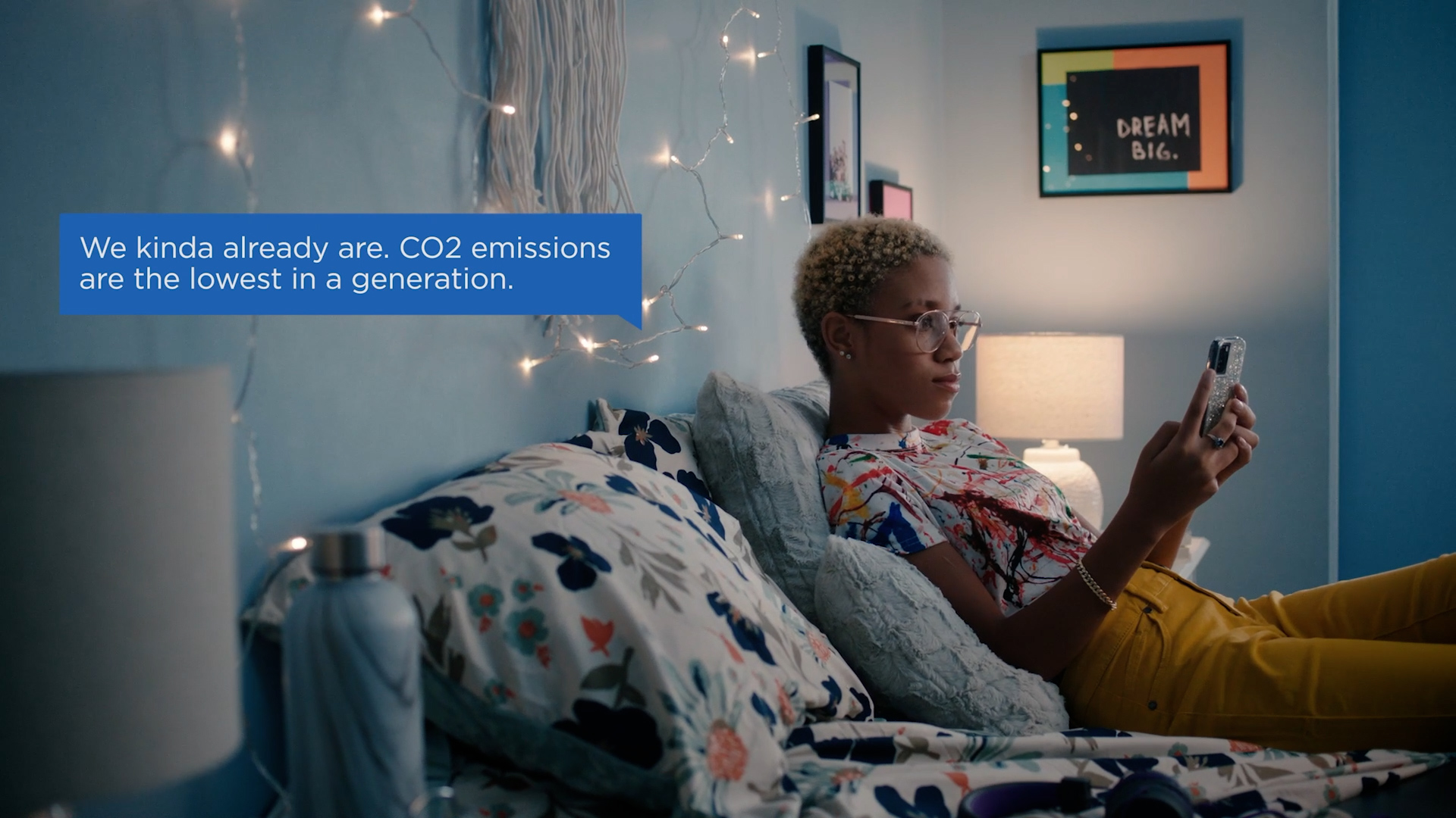
Consideration
American Investment Council
Small Business

America's Plastics Makers
Made to be More
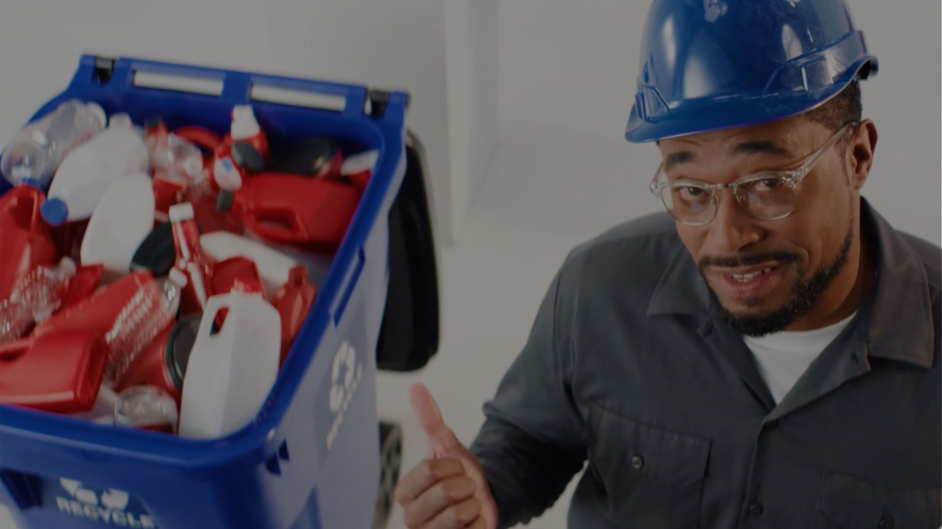
America's Plastics Makers
We Found Solutions
American Prosperity Casualty Insurance Company
Securing Our Future
American Petroleum Institute
6 Degrees
American Petroleum Institute
We're On It
American Petroleum Institute
Conversations
Beer Institute
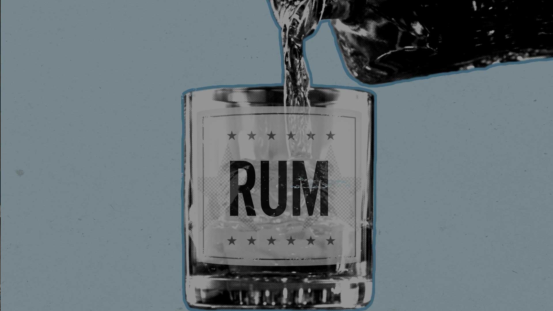
Rum Cover Over
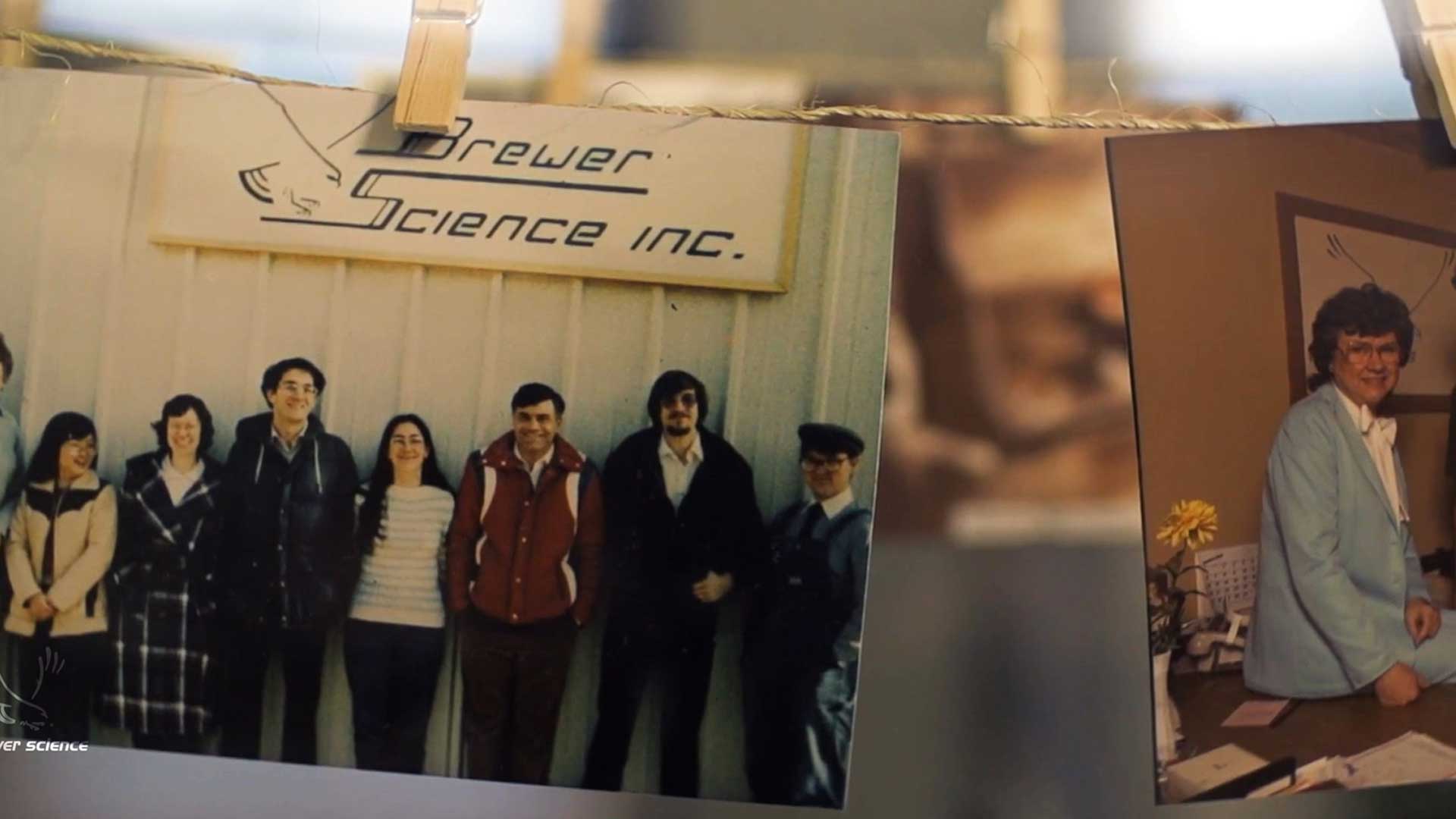
Brewer Science
40th Anniversary
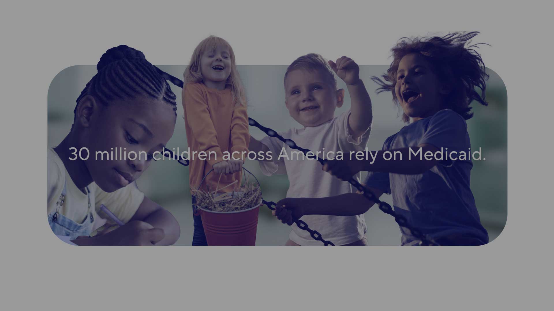
Coalition to Strengthen America's Healthcare
Kids
Coalition to Strengthen America's Healthcare
Mom
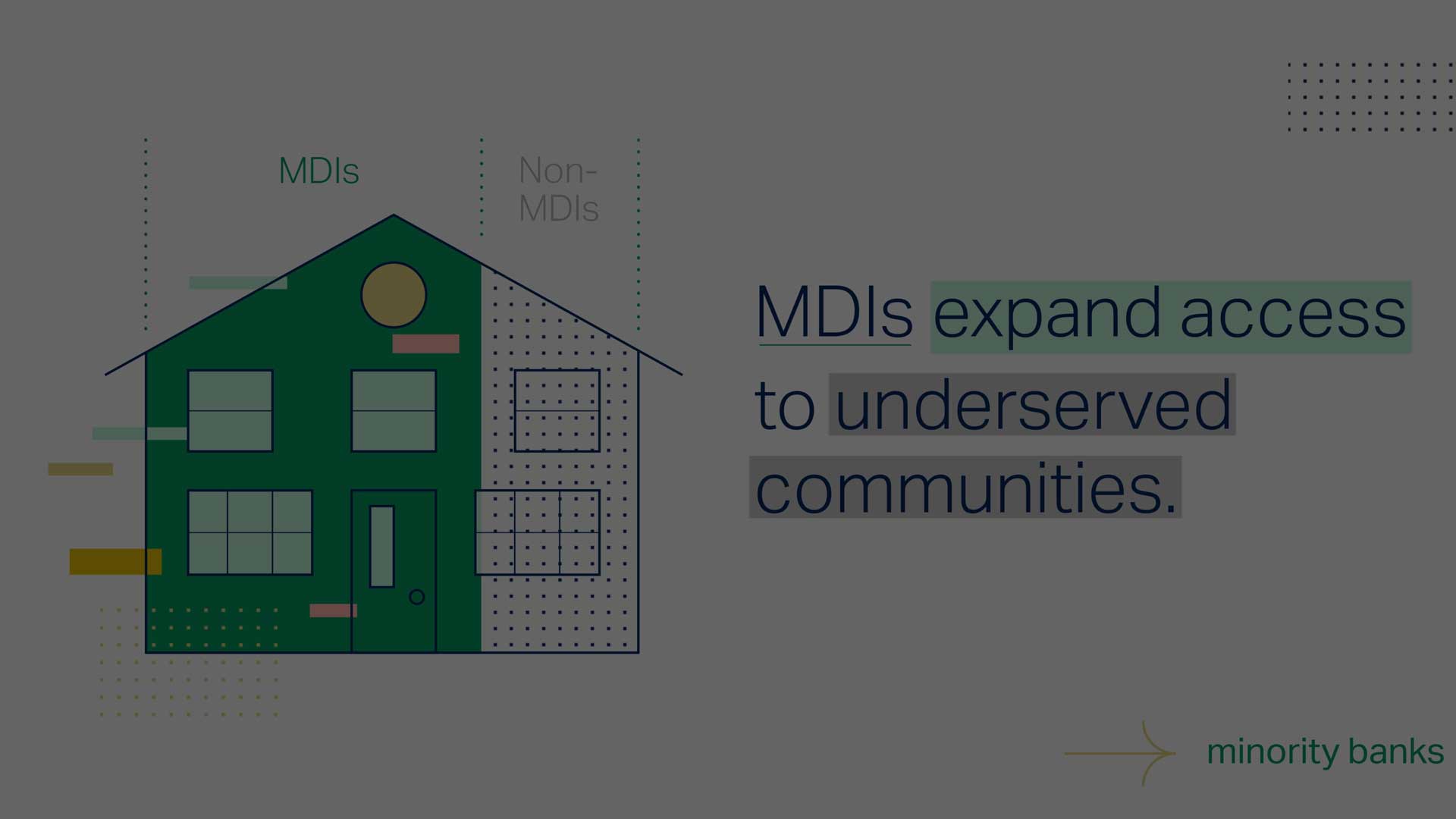
National Bankers Association
Minority Banks
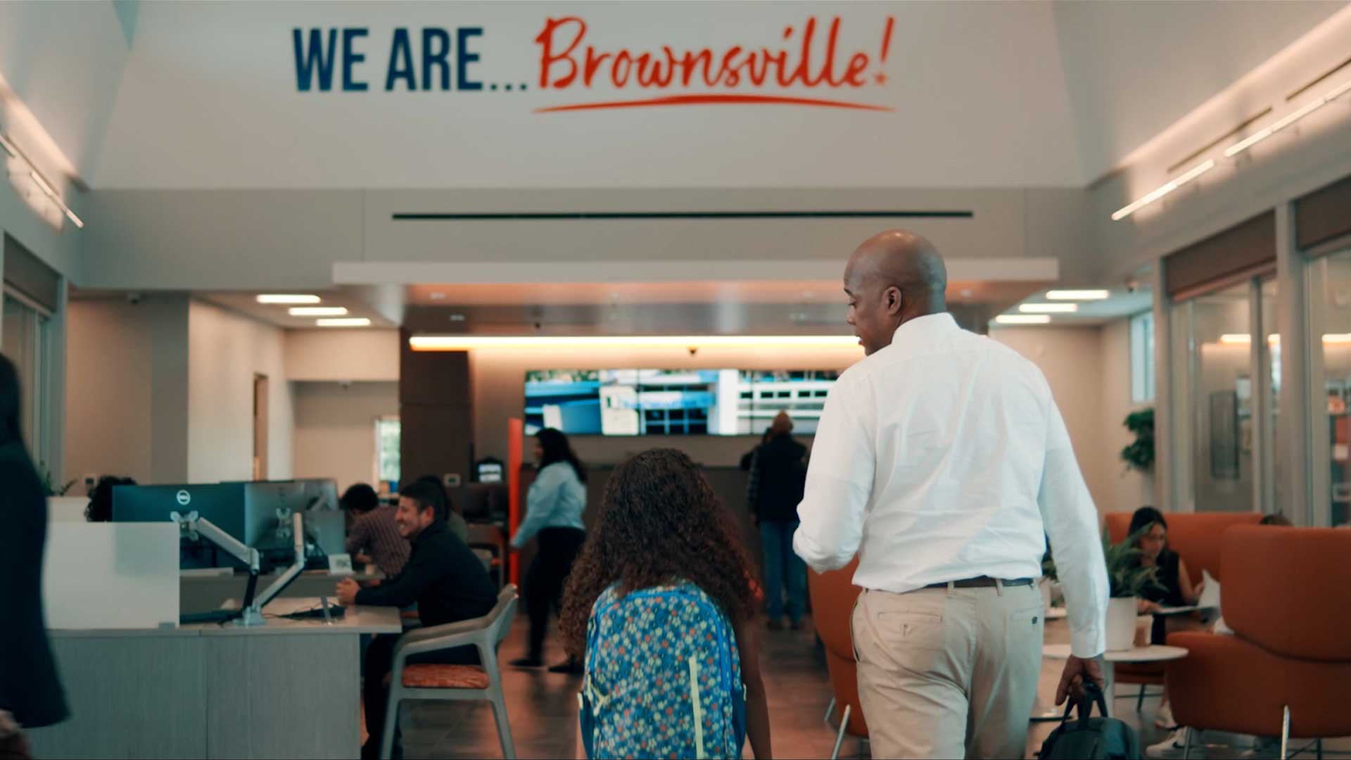
National Bankers Association
A Brighter Future
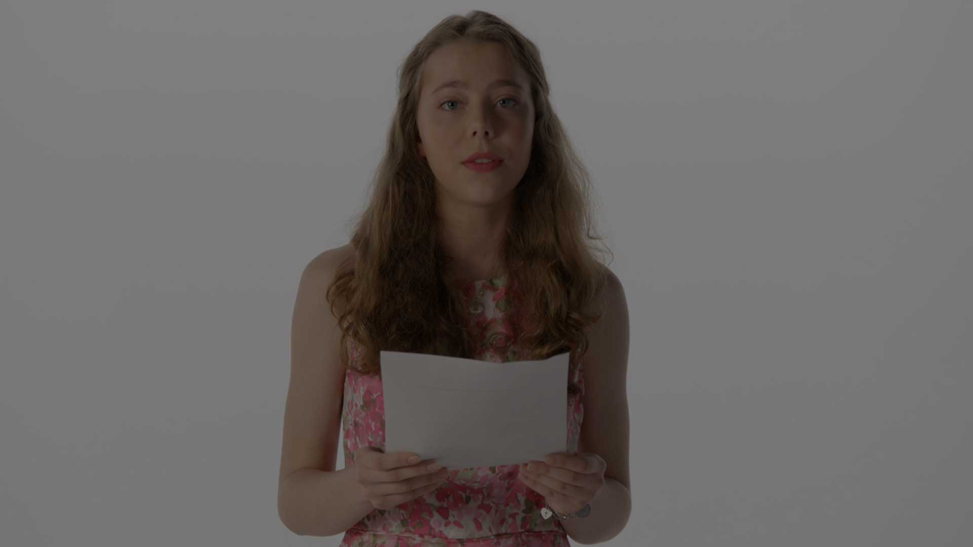
Coalition of Texans with Disabilities
Julia
Electronic Payments Coalition
Consideration
Electronic Payments Coalition
Data Security
Electronic Payments Coalition
Checks and Cash

National Association of Manufacturers
Hello Future
National Association of Manufacturers
Creators Wanted - Nestle
National Association of Manufacturers
I Love Frank

New Hampshire Bankers
Banking IRL

Virginia Tourism
Welcome to Virginia